Binge-Watching The Void: Presence, Absence, and Disruptive Agency in Shannon Crider’s Photography
by Tucker NeelPeripheral Vision Journal, Issue II
Like most Americans, the artist Shannon Crider watches a lot of television, but unlike many of her fellow couch potatoes, she actively engages her position as viewer through a transformative process, slowing the consumption of televised narrative to a near stand-still. While not nearly as entertaining (or distracting) as the premier of Game of Thrones, Crider’s work attempts to make a cut into the ideological veil separating the audience from its televised, mirrored self.
Crider watches TV with her digital camera ready, always on the look out for a scene that passes the Bechdel-Wallace test. Named after the MacArthur genius award-winning cartoonist Alison Bechdel and her friend Liz Wallace, the Bechdel-Wallace test can be used to examine the presence of female agency in any work of narrative art[1]. A work passes the test if it includes two named women talking to each other about something other than a man. When Crider sees a scene that passes the test she aims her lens, takes some shots, and continues watching. After taking photographs of the story on screen, a paralyzing of the before and after into a now, Crider, edits the images, selecting individual frames holding significance outside the scripted action that gave them life, choosing instead to focus on banal interactions, whispered exchanges, the space between actresses. These otherwise overlooked spaces function as containers for a viewer to fill with their projected fantasy.
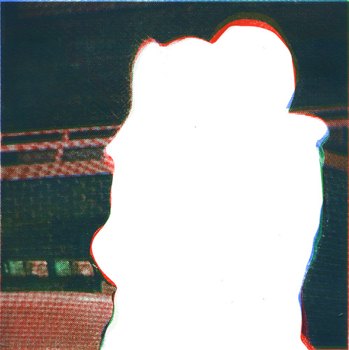
In the silkscreen series Hugs, Crider excises the women from her photographic stills, sometimes leaving body parts behind as visual markers of intimate touch. Each work’s title gives a hint as to the relationship of the absent figures. In Heroes (Hugs), a vertical abstract blob occupies much of the image forming a conspicuous cloud of negation. Because of the work’s title and context within the series, a viewer cannot help but fill the void, seeing an elbow here, a head there. In Mother and Daughter (Hugs), two sets of arms extend in a frozen embrace, their corresponding wrinkled or smooth hands and patterned clothing signing to age and gender differences. Assuming the position of an informed viewer aware of the Bechtel-Wallace test dictating the artist’s initial picture making process, it seems obvious that these works signify - perhaps even illustrate - the persistent invisibility of women in patriarchal society. Crider symbolically re-asserts the absence of female characters in Hollywood and the ensuing problems this poses for women old and young who look outward for characters, real and fictional, on which to model actions, subjectivities, and performing selves.
One need only visit http://bechdeltest.com or watch Oscar-nominated films from the past few years to see the persistence of sexism in Hollywood. Indeed, the Bechdel-Wallace test is useful shorthand for examining what is a very real and systemic problem in today's media environment. The ramifications of such a willful erasure, coupled with the regularized reduction of women to sexualized, brutalized, or simply ignored objects, has a predictably negative impact on the self-esteem of young girls. For that matter, even a cursory look at the unbalanced reporting during the recent stolen US election reveals ample evidence for the assertion that women with agency, women who can take charge without a man, and (gasp!) even run the country, are still pictured as a conspiratorial, untrustworthy threat to the “normal” patriarchal order.
On a purely formal level, Crider’s Hugs series brings to mind John Baldessari’s long-running practice of appropriating still photographs, often from movies or “stock imagery,” and isolating things - noses, hands, eyebrows, props - masking or highlighting their forms, sometimes with unusual shapes and vibrant, delineated color. While Crider is no doubt indebted to Baldessari (as are many artists making more than pretty pictures are these days), it would be foolish to stop at the similarities binding material applications. Sure, both artists use obfuscation to “slow down” an accustomed read of familiar imagery, but I think Crider’s work hinges on something very different, something far more endemic to her source material.
Like much of Baldessari’s edition work, Crider uses CMYK silkscreens to make her Hugs series and work that follows. But there’s something different about the way she produces her prints, the way she purposefully misaligns her silkscreens so that each color doesn't quite sit atop the one below it, creating a moire pattern of slightly off-register halftone dots. These, in turn, echo the ubiquitous moire patterns in her photographs, resulting from Crider using a digital camera trained on a television screen. This moire pattern unites Crider’s recent work and opens even more modes of inquiry into the relationships between technology and spectatorship, gender and identity, and all the things we fail to see when we watch TV.
Moires result when two or more identical patterns, be they lines or a regularized shapes, overlap at an angle less than 30 degrees. Whether employed in Bridget Riley’s Op Art paintings from a half-century ago, or Andrea Minini’s seductive animal portraits today, moire patterns have an established artistic lineage. But they are often created for visual spectacle, drawing on our most primal need to recognize and interpret patterns in our immediate environment. But Crider's moires are different.
In the “real world,” moire patterns are most often a “problem,” especially in graphic design and television broadcasting. In print media, misaligned registration of multiple screens or lithographic plates will result in errant silhouettes of color and unexpected blotchy gradients. In television, the phenomena is easily seen when a camera films a video monitor. Both the filmed screen and the camera “scan” their image in the same direction (top to bottom if both are positioned horizontally) in linear paths that interlace. The resulting captured image has wavy striations, subtle, yet glaringly present. It’s almost as if the TV and the camera resist each other’s gaze, speaking over one another with the same pulsating light, producing a dissonance both distracting and strangely beautiful.
The moire in Crider’s work allows the viewer to enter the image from a kind of distance, knowing hers is a printed picture of a digital picture of a televised picture. We know this because such a disruption is commonplace, often seen as a “mistake,” an interference in the transmission of information. The moire here is a violation of verisimilitude. This distancing allows for a critical remove, a place for reinterpreting the televised scene as a constructed “given.”
One cannot help but draw semiotic connections between the presence of this unintended imagery and a body of work whose source material is the conscious framing of two women engaged in conversation with each other, sans a male actor. In Hugs Crider re-articulates a doubling, producing an implied moire, or disruptive disjuncture, through extraction. It may be a stretch, but here two of the same elements are present, overlaid through a hug, a moment of contact, and this relationship renders them beyond the space of formal representation. Considering this absence is ultimately the result of Crider searching for the female agency on screen, the linguistic notion of an irregularity (or mistake) conjoins the moire and the interaction between two independent women. This concept of a frustrating (and frustrated) pair echoes throughout Crider’s work.
It would be foolish to overlook Crider’s relationship to certain working practices coming out of the 1980s Pictures Generation, with artists who made use of re-photographed images, staged “stills,” to call attention to the underlying ideological constructs that give mass-produced media pervasive meaning[2]. As with Baldessari, Crider’s formal indebtedness to artists like Sara Charlesworth, Richard Prince, and Sherrie Levine are front and center. This is not necessarily a hindrance to the work’s ability to speak to contemporary issues, as the subjects and critiques of the Pictures Generation are very much still part of American life. Perhaps if Crider’s work only stuck to predictable 2D prints it would read as mimetic. However, her application of a similar technique used in Hugs to another body of sculptural work demands one further explore the moire and pictorial abstraction as salient ways to continue a discussion of the absent female body in mass media.
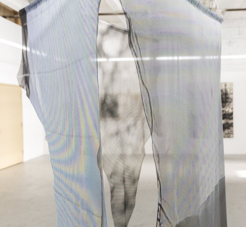
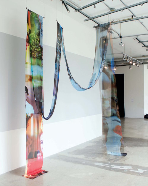
Crider’s ongoing TV Guides series includes Between, a sculpture composed of jagged strips of semi-translucent fabric draped over three horizontal supports, each individually suspended from the gallery’s ceiling. From a distance, with subtle variations of gray and brown, they look like weightless animal skins, markers of a seemingly violent act. The viewer is also able to see through their multiple scrims as erratic moire patterns punctuate each gossamer veil, again signaling the familiar discordant way a camera captures a television screen. The title itself should be a giveaway, but on close examination, one finds keys to the work’s origin; if one spends the time, it becomes apparent that the cut edges form the silhouettes of absent figures, female characters in scenes that pass the Bechdel-Wallace test.
Crider’s use of fabric might seem incongruous with her subject matter. Why would one choose to embody a formal investigation of female subjectivity in television using cut pieces of fabric? It would be too easy to go straight to equating lightweight fabric with femininity, especially given its role as a sign of wealth for both men and women since its invention. No, the reference here is quite particular.
The term moire and its expansive phenomena (including how we apply it to TV and print disruptions today) originate from a fabric treatment first developed in the 18th century. The wavy or water-like appearance of this kind of material results from a technique that manipulates the warp and weft, pressing them into an undulating pattern to produce a surface that catches the light in different ways. This pattern is often itself applied in layers to amplify the moire effect, much like dissonant silkscreen registrations[3]. Given this history, Crider’s use of fabric adds yet another moire to the mix, creating another mark of visual dissonance. The fabric itself performs this visual disruption, as does the moire pattern from Crider’s photograph silkscreened on each dangling sheet. In this work, in returning the disruptive moire, the sign of discontinuity, to the realm of the purposefully decorative, fabric-based moire, Crider executes a subtle critique. Making her images into a material object, she takes what was a “mistake” and makes it both perceptually and physically assertive. The sculpture itself has a kind of agency, even in its impotent, limp state. It occupies space and still manages to delineate the female bodies absent from the scene.
This absence, outlined by the “negative” space between bodies, reveals itself productive. With Between in particular, the extracted female figure asserts a resistant critique, something that rescues the work from heavy-handed admonition. Unlike in other works where she allows for direct pictorial evidence of the female character to remain (hands in the Hugs series for example), here the entire form is removed. What’s left is decidedly anti-climactic. Given the how each fabric’s image bleeds onto and behind another as a viewer circumnavigates the whole work, Between feels resolutely unresolved, purposefully so. The work doesn’t want to be consumed at one time and demands a kind of viewership alien from the way its source material - movies and TV on a screen - typically encounters its intended target audience.
In presenting her viewer with such limp, diaphanous, flimsy, and almost tattered assemblages of fabric, Crider denies a cathartic resolution, and does not let her audience off the hook. She rearranges the act of looking, and ultimately the watching of TV from a state of distraction-as-entertainment, the uncritical zombified gaze that lets ideology slide, into an informed, critical act, a complication, disruption, and questioning of the culture industry’s repetitive spectacle production. A transformative epiphany is not the goal; the work does not demand or promise salvation. Instead, one is left to account for what is not there: the actual, absent, representative body, whose disappearance is never accidental.
[1] The Bechdel-Wallace test was originally applied as a “rule” and not a “test” to a discussion of cinema between two characters in Bechdel’s 1985 comic strip Dykes To Watch Out For, but it is also absolutely applicable to TV, books, plays, etc.
[2] In his essay “Pictures,” Douglas Crimp set out to chart the importance of artists working in this mode. With regards to Crider’s work, I was struck by Crimp’s analysis of Cindy Sherman’s Film Stills. Crimp states, “They are like quotations from the sequence of frames that constitutes the narrative flow of film. Their sense of narrative is one of its simultaneous presence and absence, a narrative ambiance stated but not fulfilled.” Crider employs a very different reinterpretation of the film still using vastly differing materials and methods, but her work seems to operate in a similar fashion, exploiting the viewer’s innate desire to overlay narrative onto the image at hand. See Douglas Crimp’s “Pictures,” in Art After Modernism: Rethinking Representation. ed. Brian Wallis, New York: New Museum of Contemporary Art, 1984. p. 181
[3] Kindel, Eric.“Worlds of moiré: Effect, defect, accident or design – moiré has a vital place in printing.” Eye Magazine. Summer 2014 Retrieved Jan. 18, 2017. http://eyemagazine.com/feature/article/worlds-of-moir
©2024 Tucker Neel. All rights reserved.