Matt Warren Makes Movie Posters For Your Consideration
by Tucker NeelArtillery Magazine Aug 3, 2021
As any Angeleno knows, every awards season, from about September – February Hollywood studios buy up billboards to promote their films as award-worthy works of art; it’s like LA’s version of leaves changing color in Fall. Unlike normal ads for new releases, each of these billboards reminds its viewers that the film is available “for your consideration” as a potential award nominee or winner. I’ve always thought this “your” a peculiar interpolation, directed both at the general public and a very, very specific subset who get to decide who wins and who loses.
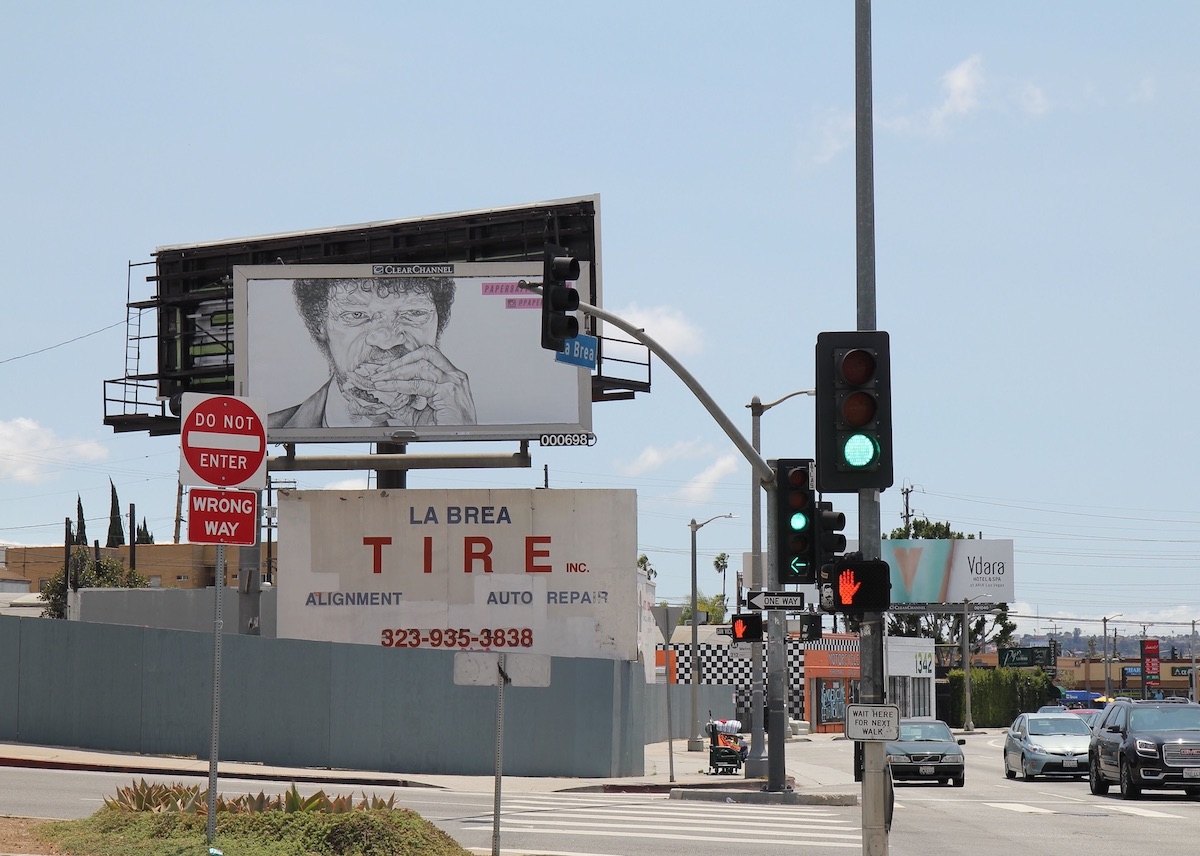
Matthew Warren, Pulp Fiction Billboard, 2016
Warren’s works highlight an unexpected “key frame,” or singular still from a film, cropping and framing it as a stand-in for the movie itself. The result is a series of unexpected juxtapositions that work on our familiarity with the format of the conventional movie poster, but upend the expected read with something else, something that calls attention to an overlooked or surprising component of the featured film. Recently I sat down with Matt and pick his brain about why and how he makes his work.
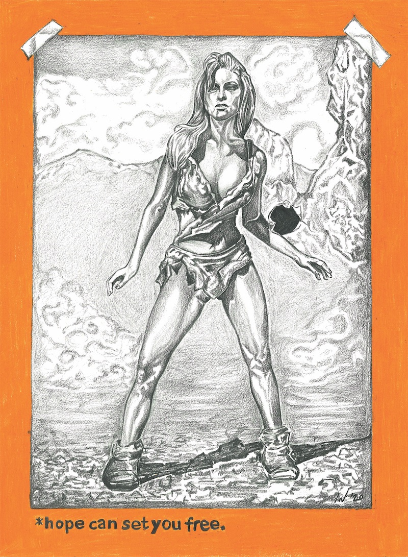
Matt Warren, The Shawshank Redemption, 2020
How do you go about choosing which still image you want to use for your posters?
I want to find an image that wasn’t used in the marketing of the film, but still has a familiarity. I want the viewer to relate and identify with the key art, because my relationship to it is paramount – I love cinema, I’ve carefully selected the movies I draw because I connect to them, and to me they represent the film in a way greater than the original movie poster does. It’s important to pick images that have a strong connection to me, because of my drawing style; you can see the mark making process, the labor that goes into the pieces, and in order to invest that labor, in order to make a good drawing I have to connect personally with the image.
The people in your work are physical, almost juicy, with every wrinkle and bead of sweat accentuated. I’m wondering what your thoughts are about the skin, the faces of movie stars, since you don’t really present them in an idealized way?
I exaggerate, use a kind of hyperrealism, so that the viewer sees the mark of the pencil. Emphasizing the harsh detailing transforms something that in society, maybe we have been conditioned to see as beautiful and unobtainable, into something more real, more relatable.
I think that really comes out in your Alien poster.
Thanks. For that piece I used the image of Veronica Cartwright’s character. Although Sigourney Weaver’s Lieutenant Ripley is the star of the series, I feel that her character was defined in the sequel; so she’s the kick ass heroine in ‘Aliens’, but it has detracted from the pure horror of the original. In my picture of Cartwright, there’s this strain of terror etched on her face; I think it more clearly demonstrates the film’s fear, it’s intimidation.
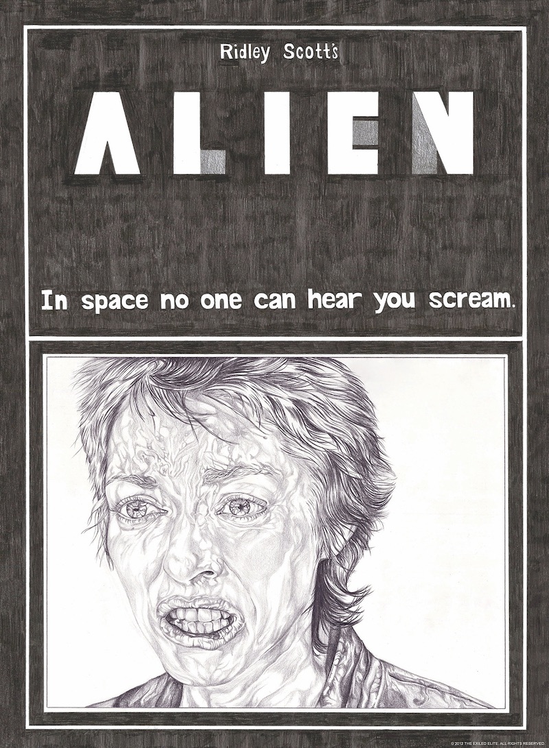
Matt Warren, Alien, 2012
With your work, in order to “get” the references you have to have seen the movie; it’s an inversion of the original movie poster, which tries to get you to see the movie for the first time. When you look at your posters there’s a familiarity, but the unexpected image causes a double-take. Do you think about this audience familiarity when you start to create your work?
I think the movies I select have a place in the lexicon of cinema – they are classics or cult films, and there is a general familiarity with them. I like the phrase ‘double-take’ in relation to my work, because there can be a moment of uncertainty when people first see it, before ‘getting’ it, where the viewer may be hesitant about the originality of the work. It’s not a copy, but it takes elements from the film and the marketing campaign, which are manipulated and crafted. The composition, typeface, color, key art almost act in a subliminal way.
I think the True Romance poster does this, because you really have to know what you are looking at to “get” the poster.
Well, the Patricia Arquette character ‘Alabama’ who I have focused on, is very spunky, and wears a turquoise bra and pink leopard print leggings. The director, Tony Scott was known for his bold, flashy film making style, so the film’s aesthetic style is transmitted to the poster through that color scheme. The typeface comes from the pre-credits sequence. Her character is clearly defined – she brings certain virility to the role, in this male dominant movie. And of course this scene provides an interesting and powerful image to draw.
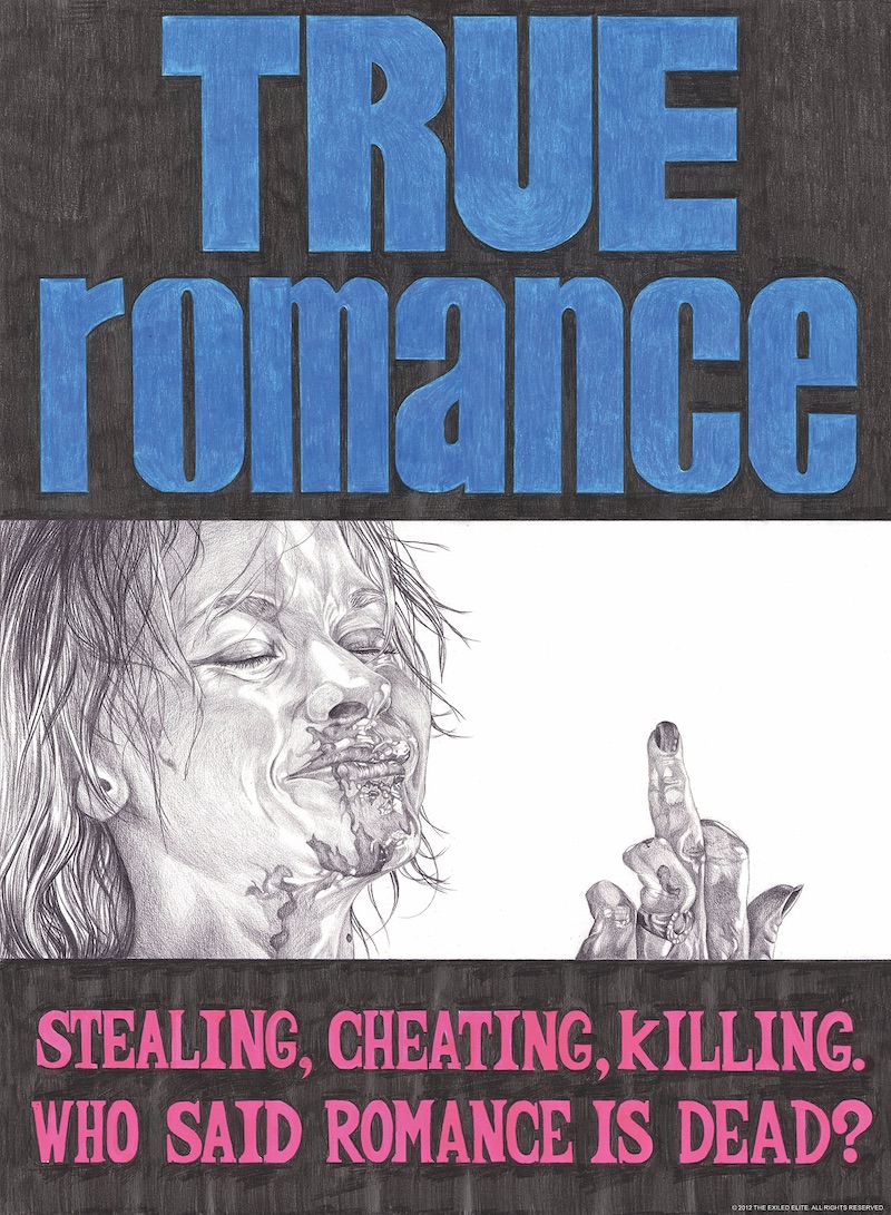
Matt Warren, True Romance, 2012
A few years ago you put up a series of your posters on billboards across LA. How did this shift in scale change your thinking about your work and what are your thoughts about how movies are advertised in LA versus other parts of the country and the world?
The billboard project gave me a fresh perspective on how I was putting my designs out into the world. Visually, seeing my work 24 feet high as part of the Los Angeles skyline was very surreal, especially given that some of the selected images were in or around the locations that the films were shot. The functionality of the billboard works in LA like everywhere else, but with their “For Your Consideration’ campaigns, they are also equal to being the studio’s version of post it notes. During awards season is one of the times of the year that I’m really aware that I’m in Hollywood, with these campaigns that act as ‘reminders’ to industry professionals, and by just being in the city, we are swept up in this conversation we’re not part of. As my art practice explores the function of Hollywood and the star system, it’s fun to question Hollywood’s “culture industry,” its mechanisms of advertising, branding and fashion production.
©2024 Tucker Neel. All rights reserved.